As one of the Chinese leading printing companies who are privileged enough to regularly work with many great clients, we know how important it is to know the difference between RGB and CMYK colour modes and also, when you should/shouldn’t be using them. As a designer, getting this wrong when creating a design intended for print will likely result in one unhappy client.
Many clients will create their designs (intended for print) in an application such as Photoshop which by default, uses the RGB colour mode. This is because Photoshop is mainly used for website design, image editing and various other forms of media that usually end up on a computer screen. Therefore, CMYK isn’t used (at least not as default).
The problem here is that when an RGB design is printed using a CMYK printing process, the colours appear differently (if not properly converted). This means that although a design might look absolutely perfect when the client views it in Photoshop on their computer monitor, there will often be quite distinct differences in colour between the on-screen version and the printed version.
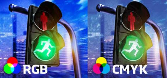
If you take a look at the image above, you’ll start to see how RGB and CMYK can differ.
Typically, blue will look slightly more vibrant when presented in RGB compared with CMYK. This means that if you create your design in RGB and print it in CMYK (remember, most professional printers use CMYK), you’ll probably see a beautiful bright blue colour on the screen but on the printed version, it will appear like a purple-ish blue.
The same is true for greens, they tend to look a little flat when converted to CMYK from RGB. Bright greens are the worst for this, duller/darker greens aren’t usually as bad.
Post time: Oct-27-2021